Amazing! I love the colors, so simple.
The only thing I can tell you about is lighting. One of the characters show its lighting to be on the left while the other shows it on the right.
Also, try to lower your head just one or two pixels down.
Like always, hair shading is fabulous, ugh, I wish I can do girl hair.
Try not to make the legs be straight down, use some curves.
Ex:
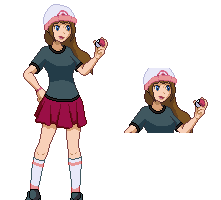
As for the shorts,

For some reason, the AA makes the bottom part look jaggy. Try to fix the outline in that case.
Also, the shading of your shorts seems a bit too flat and doesn't look as if it's bending in the sides.
The eyes for the second girl,

A lot of colors! I think one color for the black (eyes and lashes) is fine. If you don't have any white in the eye and you're wanting to blend it in with the skin color, just use the shades for the skin tone.
The eyes for the first girl,

Like the first, too much colors for a small eye. You basically pillowshaded the eye.
Skin tone,
Well it's a light and nice skin tone, but I think you should try to add a bit more value to the shades because one of your shading color is not visible.
My opinion for the head is that I think you should have made them a bit longer in height, just a little.
Good job! Loving your work, though!


Originally Posted by N!chola$


 Reply With Quote


